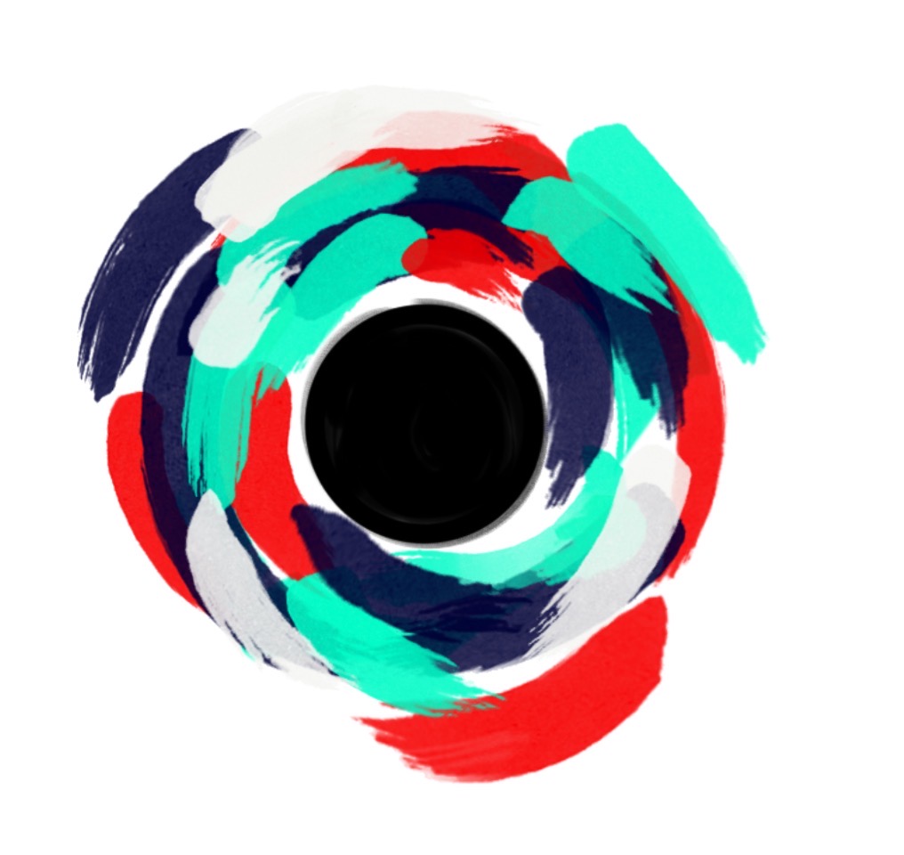
This post may have a gloomy title but, I promise it won't be that bad! I'm trying to record my failures here so I can learn from them. So here's the development of my latest piece that really didn't work (but let me know what I could have done better!):
Testing the Pallete
Putting the colors and textures together before you begin your piece is always a good idea. Thats what I did here. I even attempted to add streaks to the blocks of color but I quickly realised that did not fit with the rest of solid colors.
Practice Piece
I then practiced the technique required. I used a palette knife that I cleaned before every stroke. This allowed me to realize that mixing colors would make the palette more interesting. But the lightest yellow would allow the background to show through.
The Unfinished Final
This is the final piece that I eventually gave up on. I genuinely loved the color pallet and therefore background but the original plan included the 'swirls' overlayed. However, as I started to build it up it began to darken the background colors and become more of an eyesore. Perhaps if I had enlarged the design it may have worked together better. All in all, not my best work but I am still genuinely proud. The color pallet is one I will use again and I tried to bring life to my idea! So I thought I would write this post to make sure your failures don't go in the trash or in the back of your closet. Learn from them!
Shivani
Art is a Language is an online portfolio as well as store for Shivani Sarjan’s artwork; focusing on sharing development, processes and final works as well as how an amateur artist may accomplish these.
